Are your maps accurate? How these tools can struggle to capture our world

Maps are imperfect drawings of our world that distort how we perceive size, distance, and even where things are really located
You’ve (probably) never seen the world unless you’ve served a stint on the International Space Station. Only a few hundred people out of billions of folks alive today have ever seen an undistorted, unblemished, and truly accurate view of our home planet.
Maps and satellite images are a brilliant substitute for a firsthand view of Earth. But make no mistake—maps are not entirely accurate, and satellites that take pictures from space have their own problems as well.
But how does a map or even a satellite image not tell the whole truth?
DON’T MISS: Why that wild weather map you saw on social media is probably bogus
Knowing a map’s flaws helps grow our understanding
It’s important to understand a map’s flaws in order to better understand the world around us.
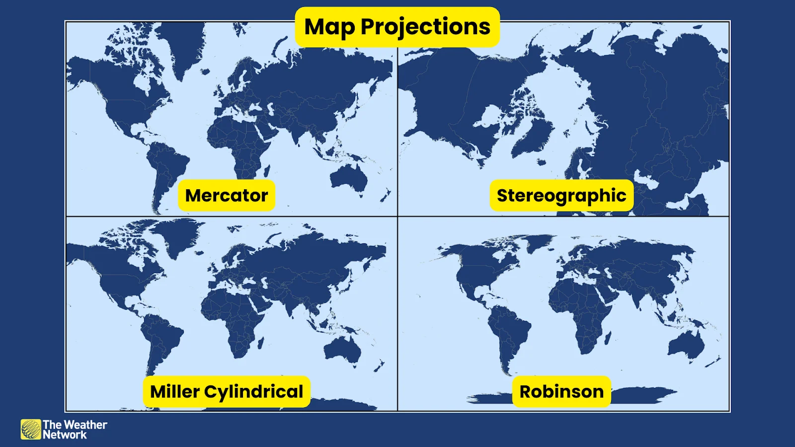
Projections are the main culprit. It’s impossible to perfectly map out a spherical world on a flat surface. We have to use different projections that distort the land in order to chart everything we want. The size of countries and bodies of water are a direct result of a map’s projection.
Most projections favour the lower latitudes at the expense of the poles, allowing places like Florida to appear more realistic than Greenland, which often looks like it's swollen from a bee sting due to the distortion involved.
Distance is relative—and surprising
The problems with projections don’t end with comically large chunks of land. Our perception of distance and position are directly affected by a mapmaker’s choices.
Did you know that Alberta is closer to Russia than it is to Newfoundland and Labrador? Alberta is about 95 km closer to Russia’s Big Diomede Island than it is to the westernmost point in Labrador.
RELATED: Where was Canada located millions of years ago? Interactive map pinpoints cities
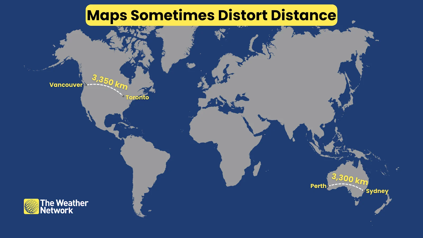
How about Australia? That continent in the southern hemisphere often appears so small on maps that it’s easy to overlook that it’s the sixth-largest country on Earth in terms of total land mass. The distance between Sydney in the east and Perth in the west is about the same as the distance between Toronto and Vancouver.
Distortions don’t stop with mere size. Cardinal directions themselves are subjective. The decision to make the north pole the top of the map is arbitrary.
It’s even difficult to discern where places are relative to one another. After all, London and Calgary lie at roughly the same latitude—but you’d never suspect it just eyeballing the map, especially given their vastly different climates.
How distortions affect weather maps
If our maps aren’t always perfectly accurate to the world around us, then what does that mean for everyday weather maps?
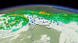
The distortion of size and distance is usually prominent on zoomed-out maps that show entire continents or the whole world. Most of the maps we see on a regular basis—precipitation in Ontario or temperatures in British Columbia, for example—aren’t just closeups, but they’re often snapshots of accurate 3D globe renderings rather than flat map projections.

But there are times when some weather maps aren’t always as they seem.
Modern weather radar is a lifesaving tool that can spot dangerous storms and flooding rain across the country. But the radar beam itself gradually climbs higher off the ground the farther away it travels from the radar dish.
This results in the radar looking at precipitation higher and higher above the ground over vast swaths of land, sometimes missing the entire bottom of a storm—no small matter when there's rotation or strong winds involved.
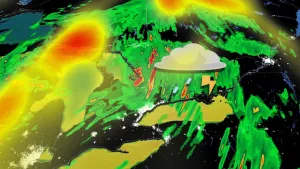
Sometimes this causes a radar to detect rain or snow that’s not actually reaching the ground, a phenomenon called virga. The opposite problem is also possible—mist, drizzle, and very light rain can fall from clouds that are too low for radar to see.
MUST SEE: Canada to benefit from major U.S. funding for weather, tsunami alerts
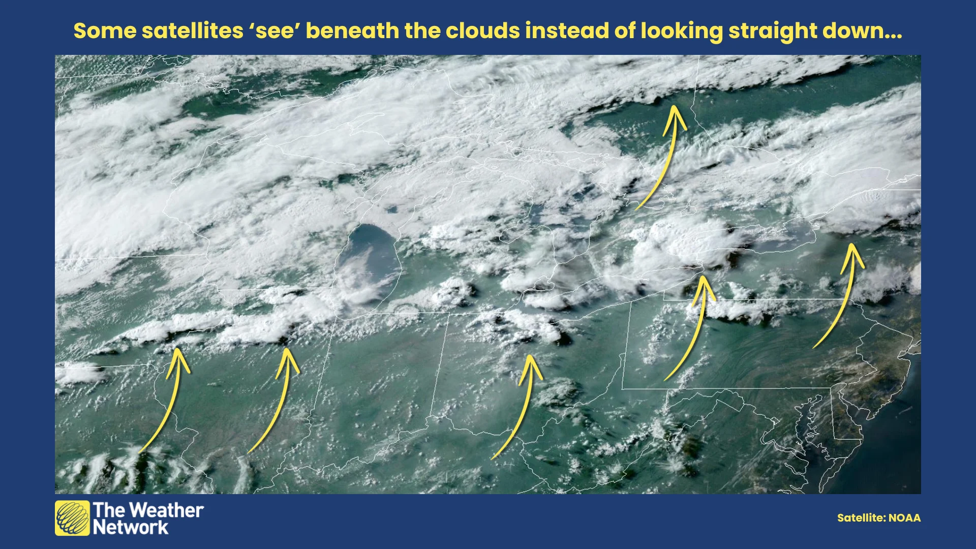
Satellites aren’t immune from issues of their own. Clouds on satellite imagery are usually offset just a little bit from where they appear to be due to the parallax effect.
Most of the satellite images we see every day are taken by equipment orbiting the equator. These satellites look at our clouds on a slight angle, peering beneath them a little bit instead of directly down at them.
This effect is greater farther away from the equator, making it possible to see features like cloud shadows and even the structure of supercell thunderstorms.
Header image created using imagery from Canva.